Background
D&C is a Financial Services company based in Jersey, Channel Islands. D&C is, at the moment, the directors: Derek McKeown and Chris Curtis – both highly experienced Investment Bankers.
They have 2 companies: D&C Consultants and D&C Advisory. Each is a separate Limited company, and the distinction between the two is a practical one with reference to financial services regulation – in terms of the advice and scope one or other (of the companies) can give and provide. i.e. Authorisation to provide investment advice, mortgages, loans… etc, hense the split, dependent on the services.
D&C came to us to develop, from scratch, a bespoke website (well 2) where many of the resources for each site were shared.
Early design stages
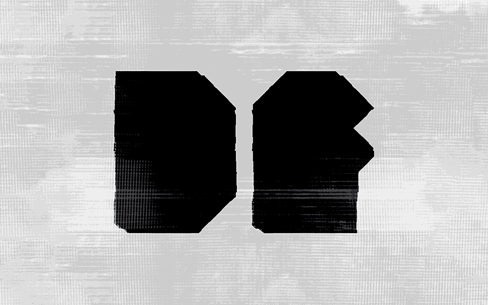
All we had to start with were the 2 logos supplied by another designer and no brand guidelines. So I had a blank sheet of paper as it were with which to design… which suits me perfectly by the way.
So I took the core colours of the logos and then looked at creating typography which was vaguely in line with the ethos of the logos – ie headline font to be a serif – with a sans serif to compliment the serif. For ease of delivery online, I selected 2 fonts from the google fonts options as the fonts of the logo were not google fonts and I didn’t feel it necessary (or desirable) for the whole identity and website design to be a slave to the logotype. [Update: this has been changed on the live version – but that’s the beauty of CMS!]
Design, development & delivery stages
I already had an idea of overall elements that I wanted to incorporate into the designs: primarily, the use of solid blocks of colour, the use of subtle micro-animations in the UX display, and also a desire to incorporate “white space” within the designs.
By “white space” I mean allowing copy and elements to “sit” in areas with lots of space around them so that they effectively then become design elements in their own right. So often clients want to say too much and as a consequence less gets across to the user. By saying less, it makes the design and UX stronger and the messages clearer.
Once the designs were signed off the developer coded the site from scratch and, as always, (we’ve worked together on a number of sites now) excelled at implementing the designs and ideas we’d, of course, discussed all of the way throughout the design process, into the exact reality of how we wanted the sites to work, and as a fully responsive site, how the modifications to transitions, etc would then translate onto smaller canvas sizes such as tablet and mobile, without destroying the integrity of the overall design ethos.
D&C Advisory & D&C Consultants.
Website design.
Image gallery & lightbox
Website design.
Image gallery & lightbox


