Background
I’m happy to say that for many years now I’ve been working closely for The Idea Works as a freelance designer.
They’ve given me a number of very exciting projects to get my teeth into and one was the Islands Insurance re-brand.
Having initially delivered stage one of the re-brand – i.e. logo and new corporate identity etc, (please see other posts on this site ref Islands) and BEOFRE we could progress to stage 2 advertising, there was a need for immediate on-new-brand advertising.
Islands advertising.
Year 1.: ASCii Illustration campaign
Year 1.: ASCii Illustration campaign
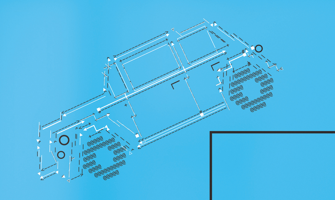
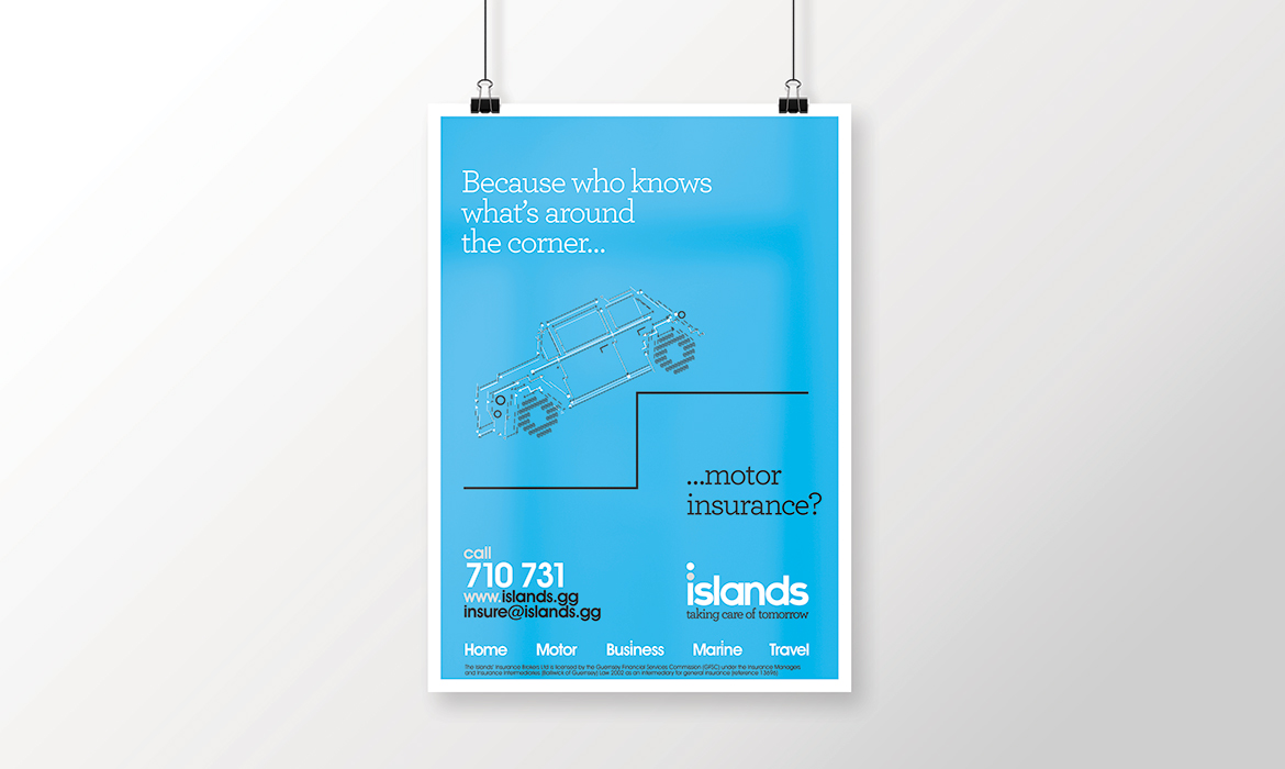
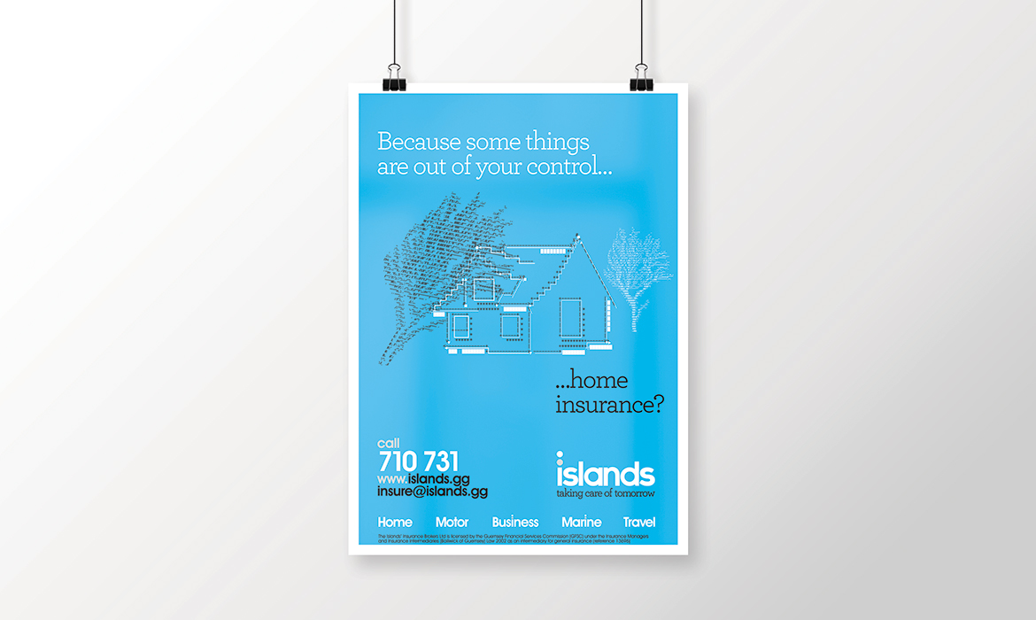
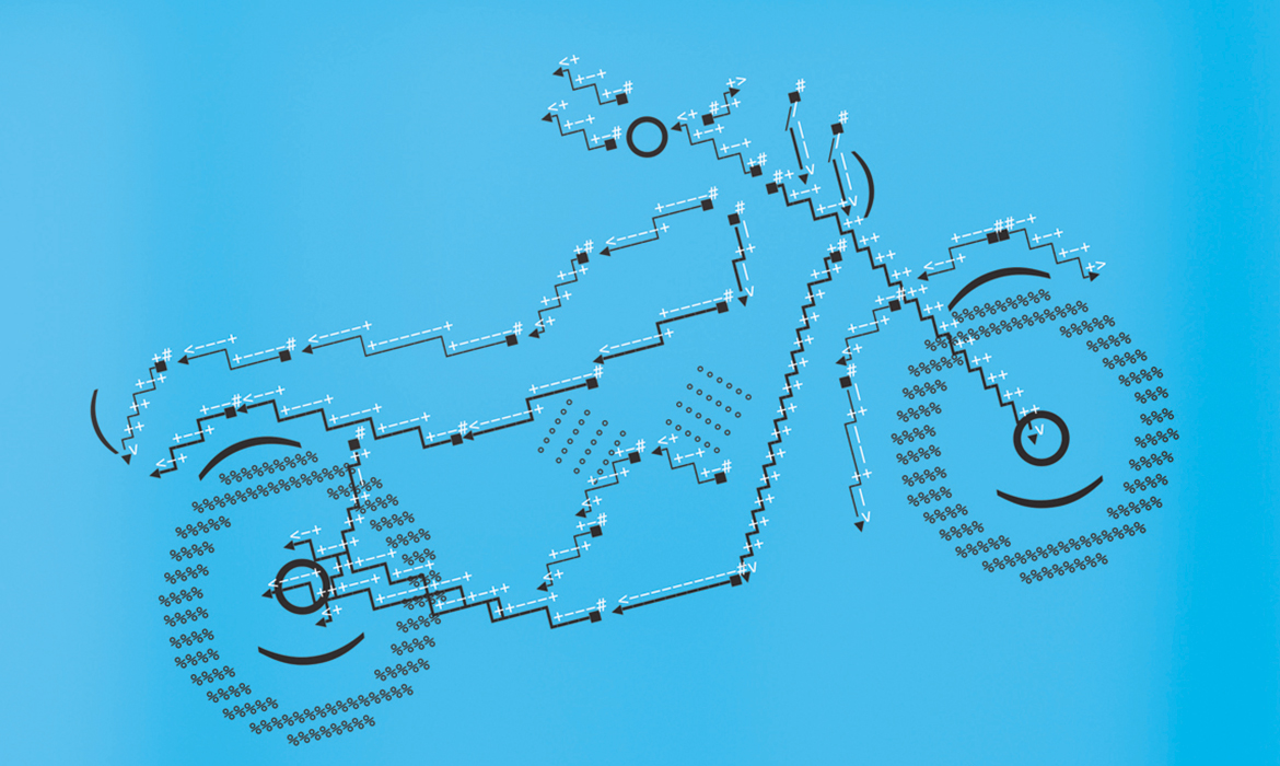
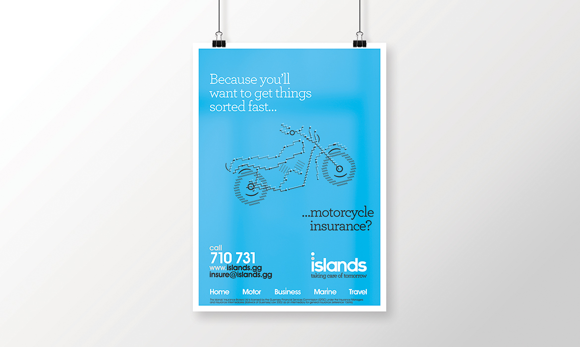
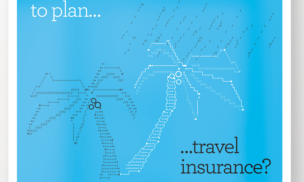
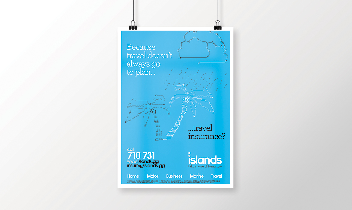
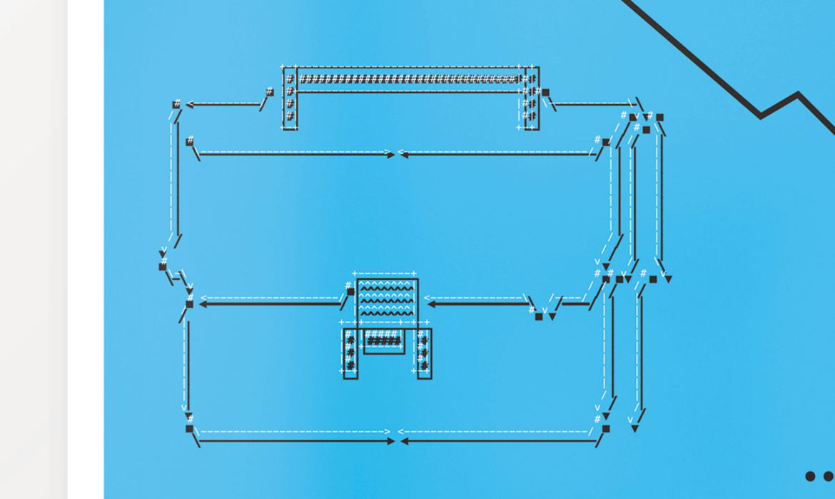
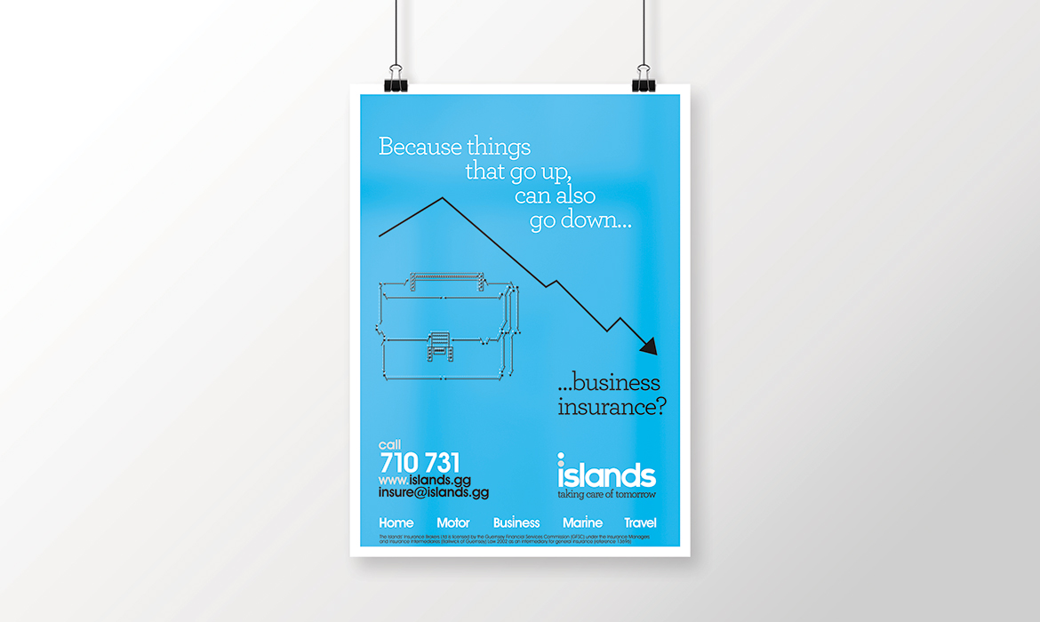
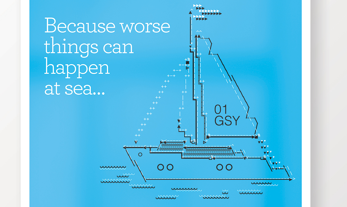
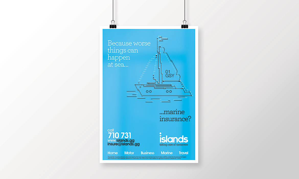
My solution was to take a very much now old-school approach to illustrating the simple propositions – but by keeping it all totally inline with the new corporate identity.
Solution: a form of illustration that perhaps a younger generation may not recognise – but one that is based in the early years of computers and their ability to form graphics. Essentially – this is again, a “Brutalist” approach to design – retro design whilst keeping it simple and upgrading it to the 21st C.
After-all, simplicity, particularly with advertising, is the key.
The image gallery displays both the copywriting / overviews as well as the details of the illustrations I created.
Islands (insurance).
Year 1. Advertising campaign.
Image gallery & lightbox
Year 1. Advertising campaign.
Image gallery & lightbox
