islands insurance. Corporate literature design & copywriting

Project Brief
As part of the re-brand of Islands by [highlight color=”yellow”]The Idea Works[/highlight] the next step was plainly to harmonise and updating all corporate and customer facing corporate literature to be in line with the new corporate identity.This spanned both the advertising, signage and way-finding systems within the offices, across all islands, as well as, of course, new policy documents and promotional brochures.
The Design Solution
As part of the first part of the re-brand I’d proposed both a primary colour palette and a secondary colour palette, which was consistent with the NFU corporate branding (whilst adding and subtracting a couple to make both harmonious).So each policy area is now colour branded. It was then simply a case of applying my corporate identity guidelines and rules to the various literature items in a consistent way.
The Copywriting Solution
I’ve supplied all the copy I wrote for these brochures as I feel they neatly showcase both my copywriting skills as well as framing my approach to it.I feel that in both Business to Business (B2B) and Business to Consumer (B2C) there’s great scope to position, through correctly written copy, the brand in both an accessible and progressive way.I’m starting from the assumption and proposition that the audience is human. And they’re not stupid. So… be human, don’t treat your audience like fools. Connect with your audience and write from THEIR perspective.
This proposition also allows for a more modern angle on the positioning of the brand to the audience. So… in this case insurance, isn’t framed as, as I say: “boring old insurance”, it’s framed as something that you’ll have to pay for, irrespective of who it’s bought from, and, perhaps, if you break down, a bloke will come and fix you up and get you home for free. It’s a service and a benefit of something that you’ve got to pay for anyway. And that’s therefore a key USP delivered in an understandable way.And, of course, all good copy needs to go hand in hand with, and link back to, the image. That’s the role of successful Art and Creative direction, hopefully I’ve delivered that.For a similar perspective to this copywriting angle but in a B2B context please see the ad campaign I wrote for Foxleigh Knight (accountants) here.
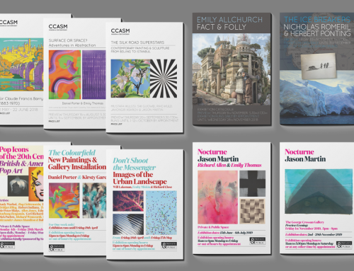
Image gallery of corporate literature designed and created for Islands for product-specific policy details


